
Google Play Store Redesigned
Early last week several prominent Android bloggers showed off a redesigned version of the Google Play Store. The redesign is now live and is starting to hit several users.
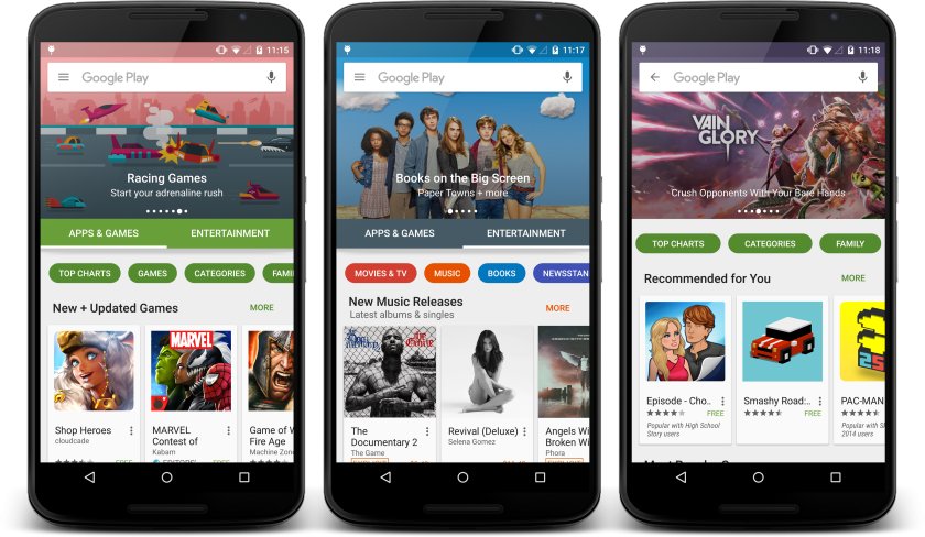
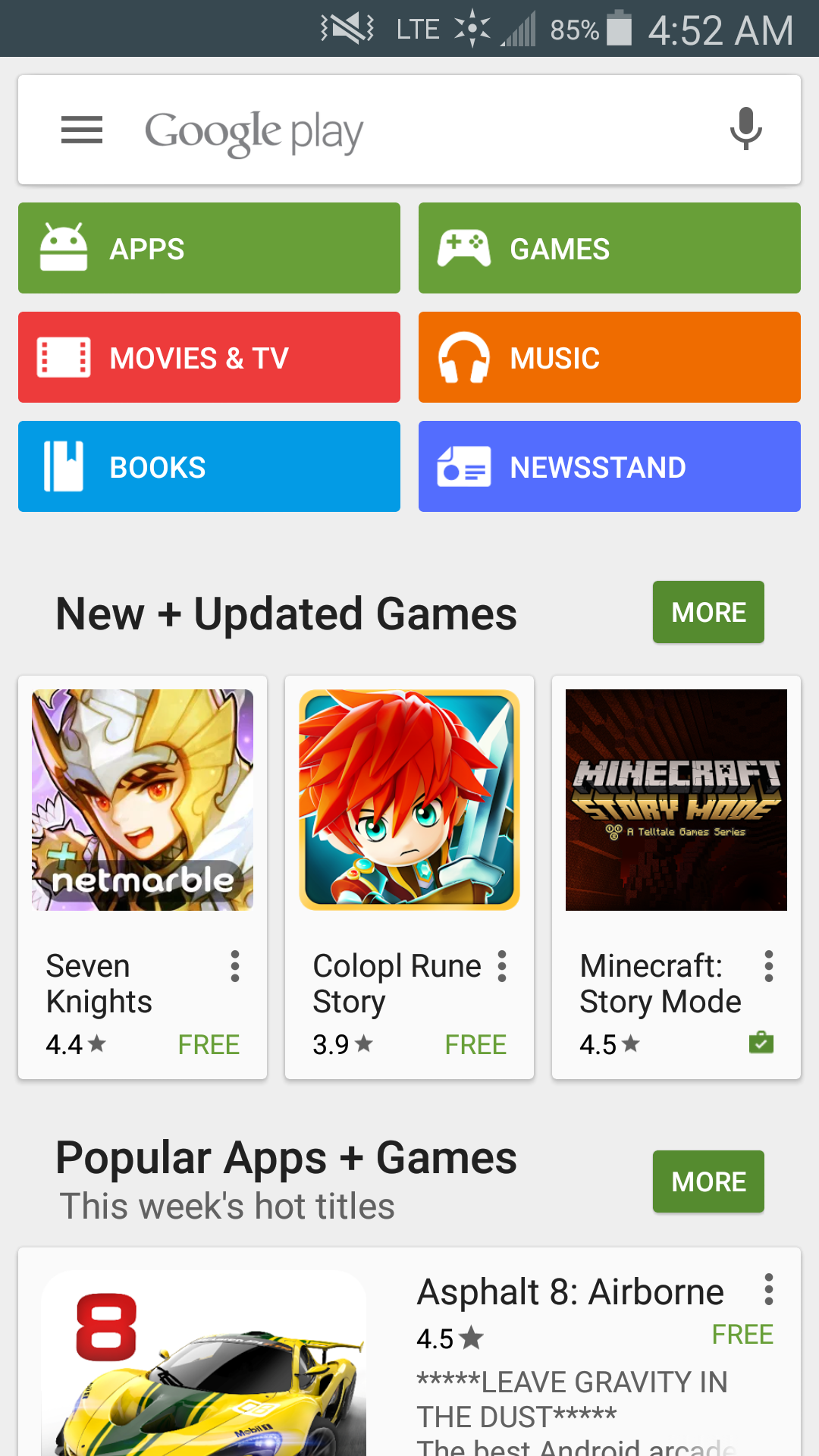
The Play Store’s new design brings about several much needed changes. Previously the Play Store had several categories across the top of the screen; Apps, Games, Movies & TV, Music, Books and Newsstand. Each category had it’s own unique and blocky button/icon. Below the icons were several highlights from the different categories that were often merged together into one. If you were looking for something specific it was difficult to find at times as books and music were mixed in with games and other apps.
Google’s redesign of the Play Store brings us a much smoother looking UI. Gone are all the blocky buttons and now we have two category tabs with sub-categories represented as a button with rounded edges. The two main categories are Apps & Games and Entertainment. Beneath Entertainment you can find the old Movies & TV, Music, Books and Newsstand categories but with the new buttons instead of the old. There are still several highlights beneath each category and sub-category.
All in all it is a much cleaner design that goes hand in hand with Google’s move to a more fluid and easy to use interface across all their apps.
What do you guys think? Is this a good change or do you prefer the old look?
Source Links: Android Authority | Verge
Related Posts


About The Author
Roy R. (rwilco12)
Roy likes to dabble in all things Android and contributes everywhere he can. He owns the site rwilco12.com and its accompanying forum, he develops his own apps and ROM’s, is a Moderator and Recognized Developer on XDA-Developers.com and is the VP of Public Relations for AndroidFileHost.com.